
Sometimes you get a photo that is pretty impressive but just too dense, kinda like a really overdressed movie idol who can't spell.
.
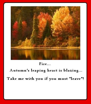
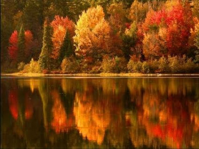
The bottom shot was impressive but didn't speak in clear tones. It had a lot of reflection effect, unfortunately, TOO much. To me that was overkill when mated up with text... the picture image would compete with the writing I wanted to do with it. So, I thought, crop out a nice portion that is simpler.
.
I uploaded the picture to the Paint program and used the selection feature to "grab" the part which kind of looked like the shore of an island, losing most of the distracting reflection effect of the original shot and gaining a great focus on the colors and the essence of the shot. Your eye could now capture the image more quickly and it made a more concise impression.
.
Sometimes less is much more... and I think a lot of modern graphic designers are going back to that as witnessed by the increasing use of simple, almost cartoonish images in many magazine ads and sprinkled iconic colored graphic illustrations in the text areas, too. It's a fresh look, using broad simple colored backgrounds or plain white rather than a lot of cluttered backgrounds.
.
Nothing's new, of course.... they did all this stuff back in the early days to illustrate all sorts of periodicals in one to three colors, where the images had to remain relatively simple. If you recall the early black and white Volkwagon ads or the placard ads in restaurants in the fifties for Coca Cola or certain brands of hot dogs or whatever, THEY used the principle of simplicity, never claiming to be high art. And the effect worked fine.
We can put photos in graphic framing or attention-getting backgrounds and mimic the same thing, which is kind of what this posting is all about.

